Dennis Patterson was president of Ben Franklin Press which started as a small Napa print shop in 1983 and grew into one of Wine Country’s major wine label printers. They also printed the majority of our posters, but I hadn’t seen or heard from him in over 30 years. When I decided to write about the posters, I finally tracked him down living on a boat near Punta Mita in Mexico.
“Working with Chuck House was great,” he said. “So many designers at that time were desktop publishers using the different fonts and they would design things without any idea about what they were doing. I had to explain that printing was a whole different thing from what they saw on their screen when they wanted to print 100,000 of them and put them on bottles. It had to work on the bottle. Chuck understood all that stuff, and if he had questions, he would ask me. I appreciated that interaction and creativity.”
Chuck House liked working with the people at Ben Franklin Press, so when we came up with the poster idea, he suggested them for the job. Dennis told me, “Producing the posters was one of the best times I had working in the business. Working with you and Chuck and Ron Zak, the creativity and interaction was really enjoyable. It wasn’t like working with all those egos in the wine industry, instead it was people who were collaborating to produce something unique. I still think “Valley of the Moon” is funny.
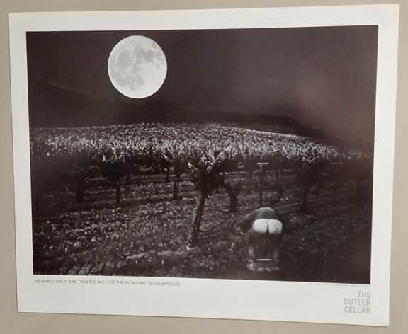
“Valley of the Moon” was the first Cutler Cellar poster. Inspired by a famous poster entitled “Expose Yourself to Art” by M. Ryerson. It features classic two-shot photography, printed seamlessly by photographer Ron Zak. Using crisp shadow and light effects, it has an Ansel Adams feel to it.
“The Cutler Cellar, the newest great winery from the Valley of the Moon simply needs exposure.”
The model with his pants down was Bill Klegg, who was 6’6” or taller. We needed that for proper perspective. He stopped by my house to pick up copies of the poster hot off the press. He sat on our couch with feet on the floor, his knees poking up in the air and bouncing with his uncontrolled laughter.
Chuck explained, “Lance was my first introduction to the wine business. I’ll always be super grateful for that. That led to Gundlach Bundschu, where I was really learning on the job. I had no idea what I was doing, but I loved it. As for the posters, they weren’t coming from me. It was more of a problem solving mission, because the work had already been done. The photos had been taken, the concept was clear, and then it was just a matter of communicating that and disappearing myself in the process. Once we started, I loved it. I loved working with Lance, Ron, and Dennis.”
Chuck said his participation with the posters was more of a liaison with Dennis making sure that the prints were the right size, and the right color with the right paper. He was very much involved with Dennis and getting the printing aspect of it working. Dennis had one of the old school printing presses that had a lot of flexibility.
“I wasn’t part of creating that imagery,” Chuck explained. “It was more like here is our idea and here’s the photo. I was just trying to find a way in. It was a good challenge to do something different, but a lot of it was working with the press operators and the ink and the color, because I wasn’t very experienced with that. Labels go onto a bottle of wine. These posters had to stand on their own, so there was more pressure. It was more difficult in that sense to do the posters than to do labels. The posters I like the most are the ones where there is the least of me involved. That Valley of the Moon poster was pretty cool. I was using a sans serif font for that and put it off to the side, so it looked rustic and modern. I was learning on the job, I wanted to find something that I was interested in. You have to be interested in what you are doing in order to be successful.”
Chuck felt the posters were more problem solving, trying to get the idea to the public in the least objectionable format possible. There’s a lot that goes into developing a proper framework for a successful poster. It’s problem solving, not blue sky imagination, but those are all the things you need to learn. “It was more like a laboratory of learning how to do that stuff that was exciting to me,” Chuck explained. “It was not I’m going to imagine something brilliant and creative here. It was more like OK, I can do this.
“For me, the real benefit was the hands on work in the print shop, which many designers now have no idea about. Even at the top level, they will just be sending off files that make no sense whatsoever other than looking good on the screen. To me, being at that right place with Lance at the right time was very instrumental, and I’ve been using that knowledge ever since. Those were really formative years for me, and it was a great experience to be able to work on those. My job was just not to mess it up too much.”
This is classic Chuck House deniability. It seems to me that his design contributions turned our pedestrian ideas into art. Compared to the pressure and drudgery of making wine, the posters were like playtime for me. It always seemed like a joint product to me. We all contributed, and that took a lot of pressure off.
Because of our relationship with Jerry and Catherine Henry, New Orleans has become our second home. In the past 40 years, close to four years of our time has been spent in the Big Easy. I had done hundreds of winemaker dinners at various restaurants in the city and throughout the state. I worked fundraisers for the local opera and sponsored a four-day trip to Sonoma for the Jazz and Heritage Youth Band. We provided lodging and food, got them a gig at Sea World in exchange for their getting to spend a day in the park, and finished with a concert at Gundlach Bundschu Winery for more than 300 people. In 1990, the City Council made me an honorary citizen of New Orleans because of all the work I had done in the community. It’s an honor I don’t take lightly. Along with Jerry and Catherine, we sponsored an annual party for New Orleans waitstaff called the Waitstaff Ball.
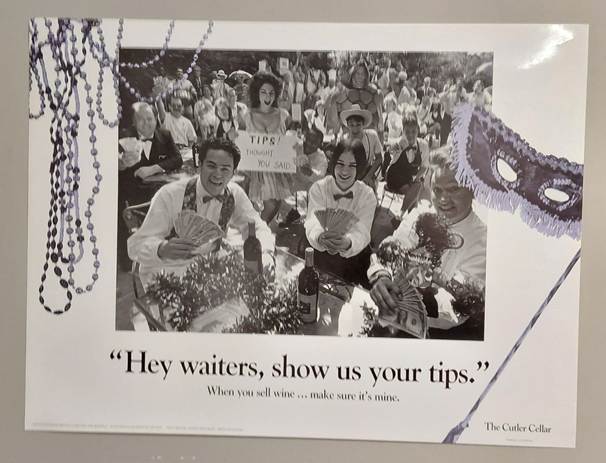
This poster was my thank you to all the waitstaff who had turned New Orleans into the single largest market in the United States for The Cutler Cellar wines. Most waiters are nocturnal creatures. That we were able to draw so many to our morning photo shoot, some dressed in costumes and others in work dress still amazes me. Not only that, but the entire sales staff from our distributor showed up just to be in the poster. The morning exuded a true sense of camaraderie. We all realized we had worked together to create something unique in the wine business, and we had fun doing it.
Ron Zak managed the unruly crowd until he got a great shot. Chuck House added a Mardi Gras mask and beads with a hint of color, which made the entire poster and project undeniably New Orleans.
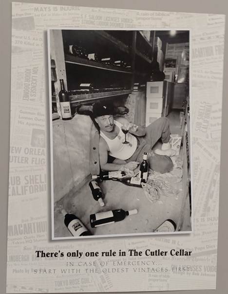
The last Cutler Cellar poster features me in my famous wine cellar. It’s in the same location as my daughter’s poster, but the feeling is completely different. The wine bottles scattered around, crumbled saltine crackers, the winter hat with the Russian star, and the wine stained shirt; there’s just something about the picture that makes me laugh.
Chuck was unavailable for this poster, so I went to another talented local artist, Bob Johnson, the exceptional wine cartoonist, and illustrator. The caption was a quote I had often used, “There’s only one rule in The Cutler Cellar, in case of emergency . . . start with the oldest vintages first.” Bob surrounded the photo with dozens of newspaper headlines declaring various disasters. My favorite is the one about Willie Mays getting injured.
The posters were an enormous success and great fun. Compared to the pressure and sometime drudgery of making wine, the posters were like playtime for me. I worked with enthusiastic, talented artists and we bounced ideas off each other from start to finish, looking for ways to improve each poster, to make it funnier or better. We all contributed, and that took a lot of pressure off.
The posters and our humorous approach to wine marketing were so successful and popular that Sonoma Valley adopted it for their annual wine auction, even hiring Ron Zak to do the photography for posters. I helped coordinate the first couple of shoots and dealt with Dennis at the printers, but soon I was out of the wine business and more focused on my writing.
After I left, the Bundschus produced two or three more posters, but eventually decided to move away from outrageous humor and skirmishes to focus on their earned place in history as one of the storied, longest enduring wine families in California.
Looking back, I wish I had done this sooner while my memory was sharper and the details were clearer. At least I got this part of the story told and documented, and most of the posters are now displayed in one place for all to see. Otherwise, no one would believe it.

Never saw that “Valley of the Moon” poster but then I sold the wine when Gary Heck owned it…. Not sure he would have approved…. LOL