Russ Koehler owned the first record shop in Sonoma. It was small but had a great selection of music. I was there one day in 1981 looking through bins of albums. I selected two or three promising African artists and brought them to the counter for purchase. Russ laughed as he rang me up. “You should get to know Chuck,” he said, pointing to a tall thin gentleman up on a ladder painting the store logo onto the wall. “You’re the only two customers who ever buy African music in my store.”
I went over and introduced myself to Chuck House. Russ told him that I was the guy who performed his wedding ceremony when he married his wife, Carolyn, and that I was the new winemaker at Gundlach Bundschu. When I asked Chuck if he’d like to take a quick run up to the winery to check it out, he jumped at the chance.
Chuck was great fun. He was enthusiastic, excited by design and he had a unique perspective on art and how it related to a wine bottle. I found out that Chuck was hoping to get into label design for wineries and that he was in fact working for his brother-in-law at Colonna and Farrell in the hope that it would lead to something.
“I don’t know if anything will come of this,” I said, but I know a couple guys who are starting a winery and they need to design a label. Would you like me to introduce you?” At that time, Larry Turley worked as an emergency room doctor in Santa Rosa. My youngest brother Scott, recently out of the navy where he served as a corpsman, worked with Larry as he prepared to enter medical school. Scott introduced us and we became friends. Larry was a tall giant of a man with a loud, raucous laugh and great enthusiasm for life. Chuck realized he had nothing to lose, so I ended up introducing him to Larry Turley and John Williams who were starting up their Frog’s Leap Winery.
Chuck House met with Larry and John. They told him about their Frog’s Leap project and asked him to come up with some ideas. A few hours before Chuck went to make his presentation, he stopped by my house to show me what he had devised. Chuck House had created several fully formed, hand colored Frog’s Leap labels.
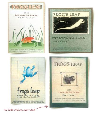
They were incredible, each one better than the last. One looked like something out of Beatrix Potter, another was very realistic, yet another was modern. They went from serious to playful, from rustic to polished. I did not envy the choice Larry and John had to make. By the time things were said and done, Frog’s Leap had their label.
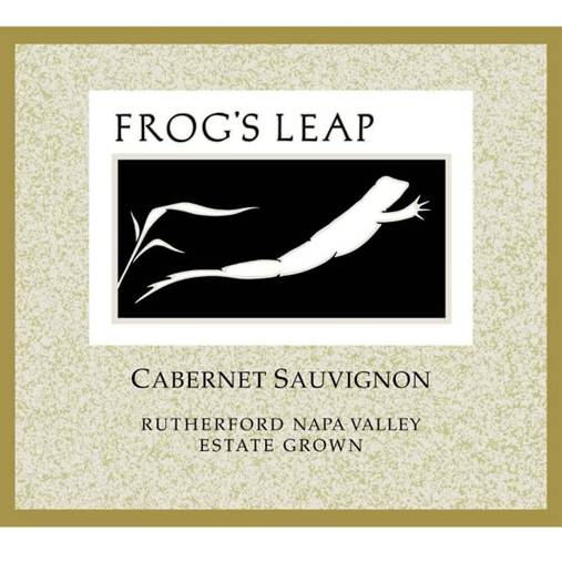
That Frog’s Leap label won a national design award, and Chuck House was on his way to a very successful career as a professional label designer. It also occurred to me that I would try to involve Chuck on any design projects I was working on in the future.

It was an award for best package design from the AIGA — American Institute of Graphic Arts. It was part of a touring exhibit called “Design from California” sponsored by the Smithsonian Institution and hence has become part of its permanent collection.
Those mockups are a real time capsule, it was before there were any computer tools to work with, obviously, so these were done completely by hand, which is why they seem a little crude by modern standards. The lettering with Rapidograph pen, the watercolor, ink drawing, and airbrush all done on that little square piece of paper.
Also of interest to me is the inclusion of the alcohol and produced & bottled information on the front, this was before back labels came into being as a result of the government warning in 1989.